
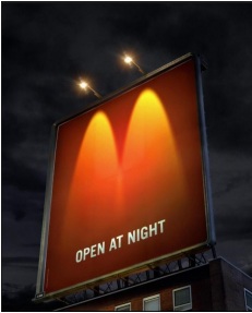
This is McDonald’s billboard advertisement with the tagline “OPEN AT NIGHT.” McDonalds are in favor of attracting people of any class as their consumers. However basing it on the advertisement, it is evitable that McDo is mostly targeting night shift workers or students with night classes since it shows in the visual the seemingly obvious time which is night time. Putting across the message as if they’re saying that that fast food restaurant is open and ready to satisfy one’s empty stomach.
What are the obvious elements present in the ad which makes helps delivering their message to its audience?
They made it such a way that the lights of the billboard would create a visual image forming an “M” which obviously looks like McDo’s logo. It also used only colors red (dominant in the photo), yellow and white and those are McDo’s colors.
WHY do I find the ad interesting?
I find the ad interesting because the designers of the ad thought of a way in which they would tell the consumers that McDonalds is available even at night in a manner where they incorporated in a creative way by putting the basic medium which are the colors and the object present which is the light (which can symbolize as like being “open” or people present in the specific place) forming Mcdo’s logo.
Once again another splendid and genuis advertisement by McDo!
